Job Numbers Mean Nothing
- Share
- Tweet
- Pin
- Share
While mathematics is often referred to as the pure science, it is often difficult to tell what numbers are supposed to mean. In the months (that seemed like years) leading up to the recent recall election in Wisconsin we were beset with conflicting numbers about how many jobs were created or how many jobs were lost and it was difficult to determine what the truth was amid all the conflicting claims.
Recently, I ran across a rather provocative set of numbers in the magazine The Week, which cited as their source the website Bloomberg.com. The site reported that from the start of Kennedy’s Presidency through 2011, Republicans had controlled the oval office 28 years, and the Democrats had controlled the oval office 23 years. Okay, those are relatively straightforward numbers, but here is where it gets interesting: they go on to report that during the 28 years of Republican control 24 million jobs were created, while during the 23 years of Democratic control 42 million jobs were created.
Now let me stop everyone right now. I am not interested in pursuing any partisanship from these numbers. You can spin these however you want. What I am interested in pointing out to all of you is that these numbers, as they were reported on Bloomberg.com, and subsequently reprinted in The Week, don’t mean anything at all.
Are you puzzled by my assertion? I’m sure there are many of you out there that believe that the employment numbers cited are just as straightforward as the number of years each party has held the Presidency. And, in the sense that both are just a matter of totaling various sets of numbers, this is true. The problem occurs when these numbers are presented as demonstrating some sort of truth without consideration of other factors.
For instance, the population of the United States in 1961 was about 183,650,00. In 2011, our population had grown to about 312,781,000. So in the 50 years covering 1961 to 2011 the country’s population grew by roughly 119,131,000.
That, folks, is a sizeable increase, which also means that there had to be job increases in order to feed all those new stomachs.
In order to more accurately represent job growth, then, one would need to consider what the birth rates for the country were during any given administration. While this could certainly be done, it would be a considerably more involved process than just adding up job numbers. The chart below shows just a selected number of birth rates for various years, which are calculated on July 1 each year (except the years 1940, 1950, 1960, 1970, and 1980 when they were calculated on April 1). The rates shown are the number of births per 1,000 people.
![]()
The next consideration is that not all of those people in the population totals are actually in the work force at any given time. And this is where the often-controversial calculation of “Civilian Labor Force” (CLF) comes into play. The CLF comes from the monthly survey that is conducted by the U.S. Department of Labor Bureau of Statistics. Each month, during the week that the 19th falls in, 60,000 Americans are contacted and asked a series of questions about their household during the week of the 12th (in other words, they ask people about the previous week). This is where the monthly unemployment figures come from and where the controversy begins.
For example, according to the most recent data, only 481 households are contacted in the entire state of Montana. Still, with various mathematical adjustments (most of which are called additivity), the Bureau of Labor Statistics feels they arrive at representative numbers for the entire state.
In order to arrive at an unemployment number, you have to know how many people there are in the workforce. Because individuals in military service are not included in this number it is known as the Civilian Labor Force. But there are other exclusions, as well. The simplest way of thinking about it is this: if you performed any work that generated tax for the federal government (i.e. withholding or self-employment taxes) then you are considered part of the workforce, regardless of whether the work was full-time or part-time.
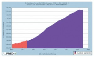
The chart below shows the growth of Civilian Labor Force since 1947 to May of this year where it currently stands as just over 155 million and the shaded portion to the right represents the years from 1961 to 2011.
So, with this growth in the CLF, in order for the Bloomberg.com data on jobs created to have any significant meaning, you would also need to take into account the size of the labor force during each party’s administration.
So now let me oversimplify to a degree. In 2011, our population was approximately 313 million and within this total population 155 million were considered to be in the Civilian Labor Force. This means that last year 49.5% of our total population was in the CLF.
So if you go back to my earlier figure showing that the population of the U.S. had grown by approximately 119 million individuals from 1961 to 2011 and multiply this figure by 49.5%, that means that our population growth alone would account for approximately 59 million new jobs!
The Bloomberg.com numbers are one of many examples of statistics that get thrown at us every day that are intended to jolt the viewer, but on closer inspection, are so superficial that they become almost meaningless. We just need to take the time to think about them before we react.