The Art of the Beer Label
- Share
- Tweet
- Pin
- Share
Beauty is in the eye of the beer holder is not really how the third-century-B.C. Greek proverb was written, but in the age of craft beer and Instagram, it has become the mantra of brewery owners who are keen on turning beer browsers into beer buyers.
By the end of this year, the Brewers Association estimates that the United States will be home to approximately 8,000 operating breweries. In the battle of the beer labels, brewers understand that it’s no longer enough to make good beer. The beer has to look good, too.
Anyone who has walked through a craft-beer aisle lately can agree that the beer industry has merged drink and design beautifully. These aisles have become miniature art galleries showcasing original illustration, photography and typography, along with the collaboration and ingenuity of brewery owners, staff members and graphic designers.
The peninsula’s breweries are in on the fun, too, turning bottles and cans into canvases to satisfy the creative impulses of their customers. Although the creative output differs from brewery to brewery, the process to arrive at their final designs is almost identical: a lot of ideas and creative back-and-forth with some talented graphic designers.
Here, some brewers share the inspiration behind their labels.
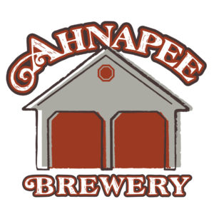
Ahnapee Brewery
If you’ve ever downed a bottle of beer from Ahnapee Brewery and want to visit its Algoma taproom, let the beer label be your guide.
Playing off its tagline, “I’ll be in the garage!,” Ahnapee Brewery’s labels showcase the unassuming, two-stall garage in Algoma that, in 2013, became home to its taproom.
“We really were just trying to embrace the two-stall-garage aspect that everyone associates with our brewery,” said owner Nick Calaway. “There’s no cat riding a unicorn on there or anything like that. It’s more classic and really just trying to be more simple about the whole thing, and that follows our whole perspective on everything — keeping things more grounded.”
Just as the original building’s exterior underwent few changes in transforming from a garage to a taproom, the beer label undergoes only subtle changes for each flavor. Aside from a strip of color and an oval to hold an appropriately selected graphic (a pineapple for its Tropics tropical golden ale and two crossed revolvers for its Little Soldier American amber ale), the garage image dominates every label.
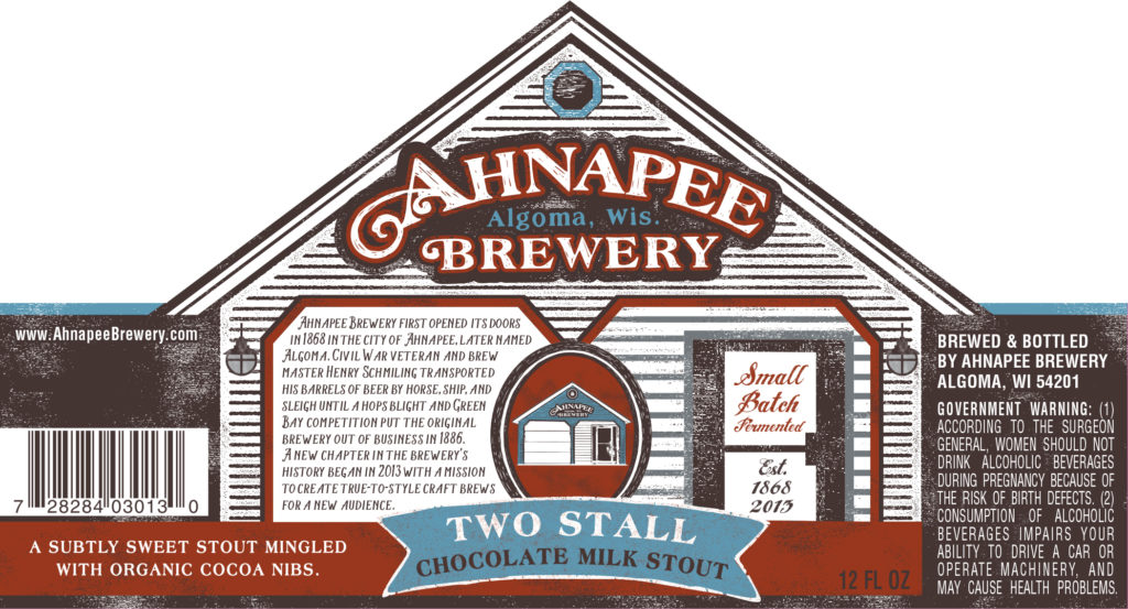
Calaway acknowledges that there is an added expense to having a custom die-cut label for the brewery, but the extra cost was worth it “to have something a little bit different” that would stand out on the shelf.
Although the label has remained largely untouched since Calaway first began brewing at and managing Ahnapee in 2013, he recently introduced a slightly modified label — his first change since buying the brewery in 2017. It coordinated with the release of PB Hobo, the brewery’s sixth release in its Hobo series.
Created in partnership with James May Gallery in Algoma, the new label stripped the garage of its detail, painted it black and used neon text and a bit of metallic “to have a little bit more of a sexy label,” Calaway said.
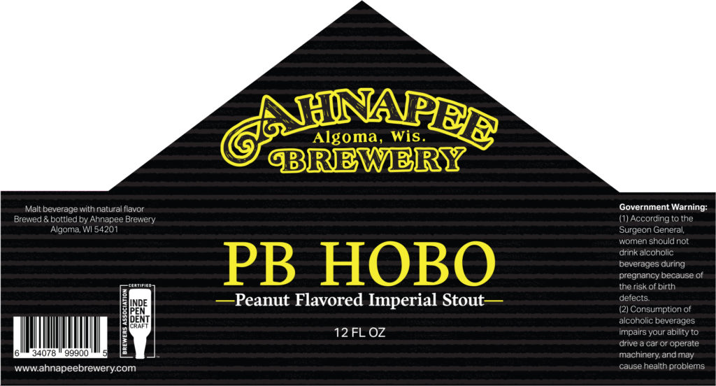
It’s a significant change for those who are used to searching for Ahnapee’s brews on the shelf, but Calaway isn’t concerned that people won’t be able to find it. In fact, he’s already tested it out.
“Putting them on the shelf [with a dummy label] and actually seeing them next to all the other beers that now are on the shelves is an important part of our decision-making,” he said. “Just making sure that it doesn’t totally blend in and stands out.”
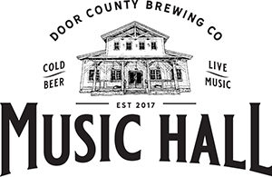
Door County Brewing Co.
For a brewery that has undergone such drastic changes since its establishment in 2012 — a new space, a growing team and creating its sister brewery, Hacienda Beer Co. — honoring its roots is still an important component of Door County Brewing Co.’s visual design.
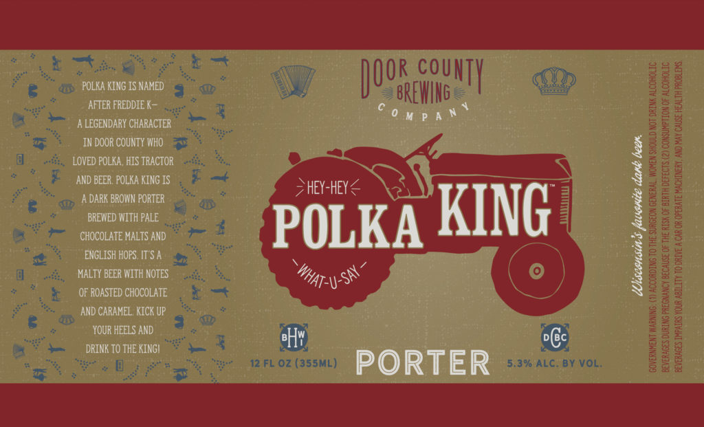
Its flagship beers are steeped in the history of Door County’s landscape and characters, which is honored through the original designs of artist Alicia Daubner, who has been with the brewery since the beginning.
“The first labels that I did were really tied in to Door County, like the Polka King and Little Sister that had this heritage link to them, which, because I’m from Door County, I could relate to and understand,” she said. “I’ve always really liked Little Sister. It had the double meaning. If you’re not super familiar with Door County, you wouldn’t look at that and think Door County, but I like that the actual inspiration behind it was Little Sister Island, one of the Sister Islands in Sister Bay. It was fun to make that a character.”
Detailed characters anchor the design of most of the brewery’s labels, from the rebellious Big Sister riding a motorcycle to the pallet jack cruiser (and caricature of brewery co-founder John McMahon) of the Pallet Jack IPA. But others, like the Blank Range Hoppy Wheat and WORS West Coast IPA, have taken a text-heavy, stripped-down approach to design.

Even with designs not rooted in Door County, Daubner insists they should be rooted in meaning — something she takes more seriously than the average beer drinker.
“I admittedly will buy things just because of the pretty label or a cool-looking label, but I analyze everyone,” Daubner said. “I think about what they’re trying to do, what they’re trying to say, what exact audience they’re trying to reach, what they are saying by it, and [what they may not] know they’re saying by it. If I look at any beer or liquor or wine in a store, I really take it all in.”
Hacienda Beer Co.
Though Hacienda Beer Co. comes from the same brewers as Door County Brewing Co., it’s a different beast. Launched in 2017, Hacienda is the playground for brewer Danny McMahon to experiment with bolder flavors, and the labels reflect that.
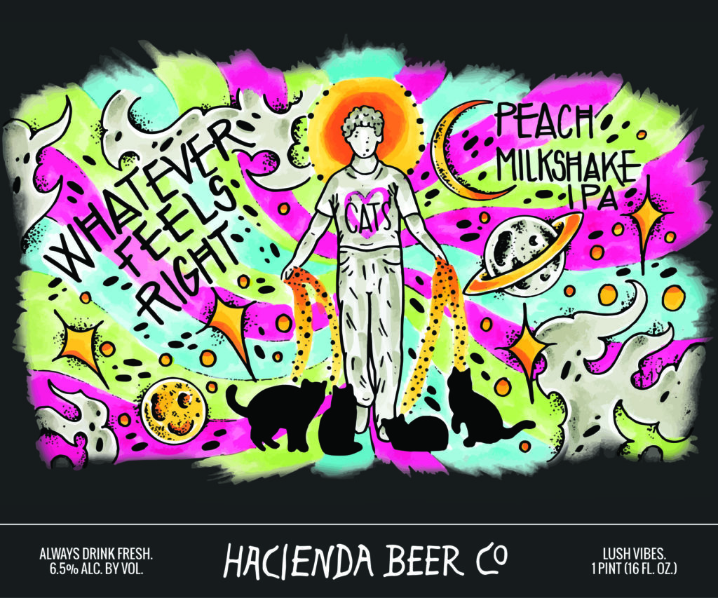
Rather than establishing a consistent appearance for its labels, the Hacienda team encourages random designs from many artists across the country.
There is nothing consistent about Hacienda’s designs except for the Hacienda name. The labels carry diverse images, from a trippy swirl of neon colors to a monochromatic hummingbird against a pale-peach background. McMahon and his crew recognize that in a crowded craft-beer marketplace, Hacienda’s labels are the best way to make a great first impression.
“We make a beer that sticks out, and we want labels that stick out on the shelf,” McMahon said. “We come up with a name, and then we go to an artist who we think has an aesthetic that matches it, or we go to an artist we appreciate and give them free rein.”
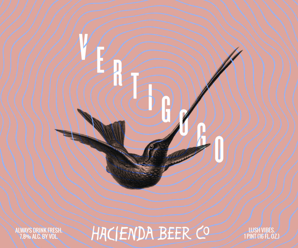
Each label is created by a different artist. Some artists are local, such as Garrett Wohnrade and Toler Wolfe, but others live in Milwaukee, England and Spain.
One Barrel Brewing
One Barrel Brewing, the newest brewery to set up shop in Door County, has been on the craft-beer scene since 2012 and has amassed a collection of light-hearted, humorous and colorful beer labels along the way.
These cheeky labels pay homage to topics as wide-ranging as Wisconsin culture (see its Copper Stag German amber, with its line art of a buck donning a police cap and aviators) and the Pantone Color of the Year (its Fanny Pack IPA is dressed in Pantone’s vibrant 2018 Ultra Violet). If you look closely at the latter, you’ll also notice one of the most beloved visual elements that One Barrel has added to the craft-beer scene: Pete the Penguin.

Perhaps the most recognizable penguin in Wisconsin, Pete became the focal point of One Barrel’s first bottled beer (prior to that, it operated as a nanobrewery) and set the stage for what would become the friendly, hand-drawn beer labels that One Barrel is known for.
Pete’s inception is close to the heart of his creator, One Barrel Brewing founder Peter Gentry.
“We were trying to figure out, what’s a friendly animal? What’s an animal everyone loves or at least no one hates?” Gentry said. “We came up with a penguin … It turns out that the guy resonates with Wisconsinites.”
Gentry — who often sketches his design concepts before handing them to his graphic designer — estimates that it took him hundreds of tries to arrive at the chubby, oblivious penguin who graces the front of the brewery’s Penguin Pale Ale.
Its humor shows, too, in its approach to designing labels for potential fads. Gentry points to the label for One Barrel’s Hypercolor New England IPA, which features a splattered blob of Pepto Bismol pink with other blobs of color here and there.
“New England IPA was a fad style that came on very, very quickly,” Gentry said. “All of a sudden, everybody needed to have a New England IPA, and it was the most popular thing, so [we used] hypercolor — if you remember from the ’80s and ’90s, those T-shirts that would change color when your body heated up. This was a total fad, and this was an homage to the fact that this beer style might be a fad, so we named it Hypercolor after that.”
In the few years since it began bottling, One Barrel has remained consistent in delivering bright and simple cartoons. But in the past year, Gentry and the freelance designer he works with, Kate Pahl of Spruce Studios, have begun going in a more artistic direction.
Two of their special releases — Spring Break Tropical Pilsner and Up North Wisconsin Lager — traded the friendly cartoons for colorful landscapes of trees, water and sunny reflections. The labels mirror each other closely in the placement of these elements, with Pahl swapping palm trees for pines and a sunset for a volcanic mountain.
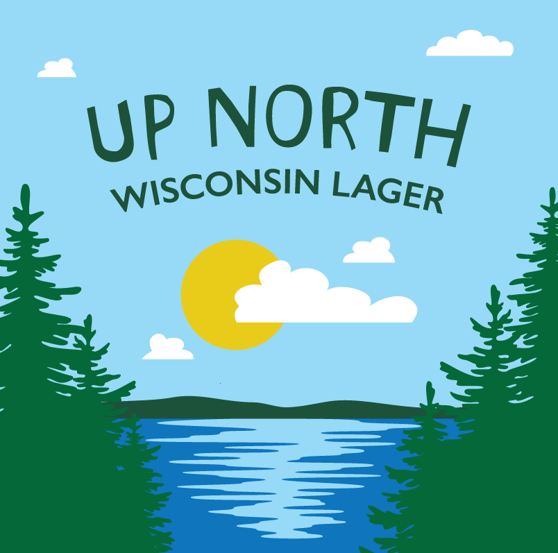
Gentry reflected on the evolution of the Up North label: the several rounds of back-and-forth that he and Pahl went through before putting the design on the back burner, then revisiting it while they were working on the Spring Break Tropical Pilsner. With a few tweaks here and there, it is becoming the new face of One Barrel Brewing.
“It kind of resonates,” he said. “That’s one where we got a rough idea, put the brakes on it, and then based on some other stuff we were doing — I don’t know if it’s serendipity or what — just found this look that we were searching for.”